Year
2020
Company
DevelopmentAid
Role
UX/UI Designer
As the only UX/UI designer I’m leading the redesign process for the website, along with the rest of the team members we use Agile methodologies by applying the SCRUM framework of 2 weeks sprint.
About the company
DevelopmentAid is a leading, innovative membership organization providing comprehensive information services for the international developmental sector. By providing a nexus of funding opportunities, expertise, and carefully curated data, we specialize in connecting donors, agencies, consultancy firms, NGOs, and individual consultants working for international development
Research
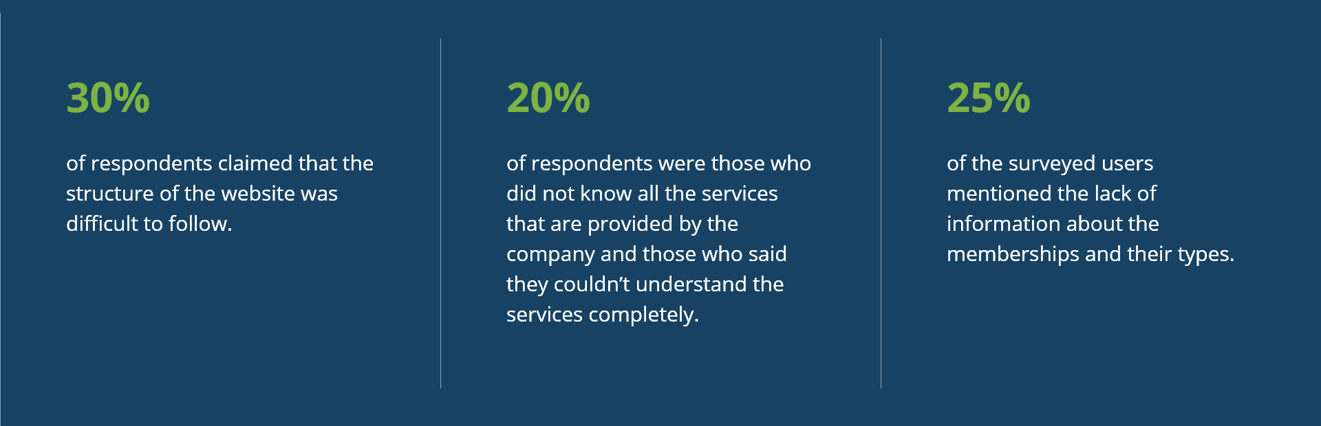
To identify issues on the old version of the website, I created a survey with questions that would help me discover the main problems users face when they interact with the website.
A few examples of the questions were:
• What issues do you encounter when you use the website?
• What DevelopmentAid services are you familiar with?
• Are you a member of DevelopmentAid? If not, what stops you from becoming one?
• How easy is it to find the information you need on the website?
• How was the registration process for you?
After surveying a total of 78 people, including interviews with 5 people and analyzing their responses, I was able to discover several significant trends that I had to address in the next phase of the redesign process
Design Challenges
The original site, though perhaps modern in its day, was incredibly dated and in need of a makeover, both from a user interface and user experience perspective.
A big challenge of this project was the client’s requirement to apply the new visual design, not radically, but step by step so that users could accept the new UI accordingly. As a result, it wasn’t easy to keep the old and new elements on the same page, but nonetheless to maintain that page as a consistent one.
The next thing was to bring a new aspect to the pages that have a lack of visual elements. For example, the home page and the pages that sell services contained only the information text in the old version of the site.
Another issue to solve was to analyze and redesign the same pages of the website from two different perspectives applicable to each of the two target groups of users. The first group – experts, those searching for job offers; the second group – organizations, those that post job offers and are looking for tenders. Each of the mentioned groups has several types of memberships, according to which users can have different rights and access to dissimilar functionality on the website.
Competitive Analysis
Below is a part of the competitive analysis study of the three leaders in the global development sector.
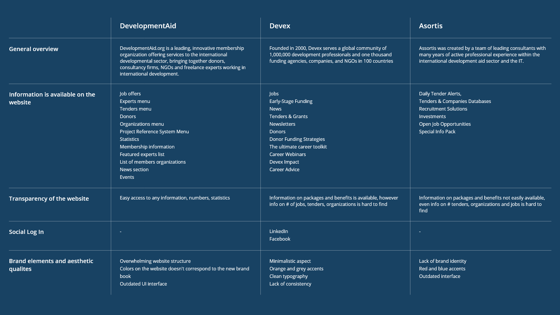
As a result, this exercise helped me to better understand information structure, layout, tone and navigation on the websites.
Design Solutions
This project was a full top-to-bottom overhaul starting with redesigning the site’s information architecture and sitemap, as well as a UI redesign and streamlining of its UX and user flows. The new structure of the site also implied the arrangement of the elements over the entire width of the screen so that the content could be displayed as much as possible.
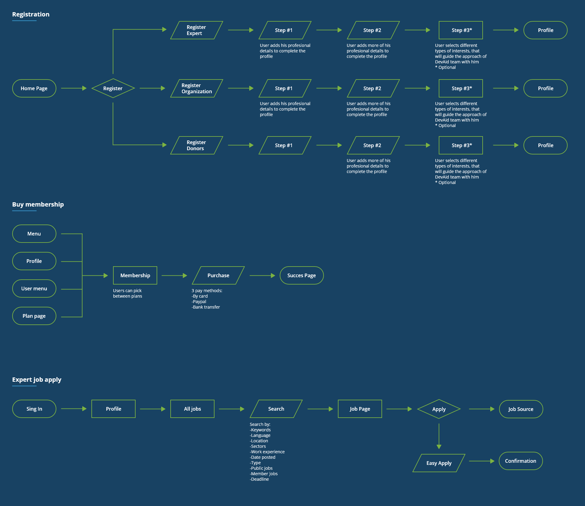
User Flows
Below I represented examples of user flows. The main idea of constructing them was to ensure that the path our users will take through the website will allow them to achieve a certain goal, in our case registration on the platform, purchasing a membership and applying for a job
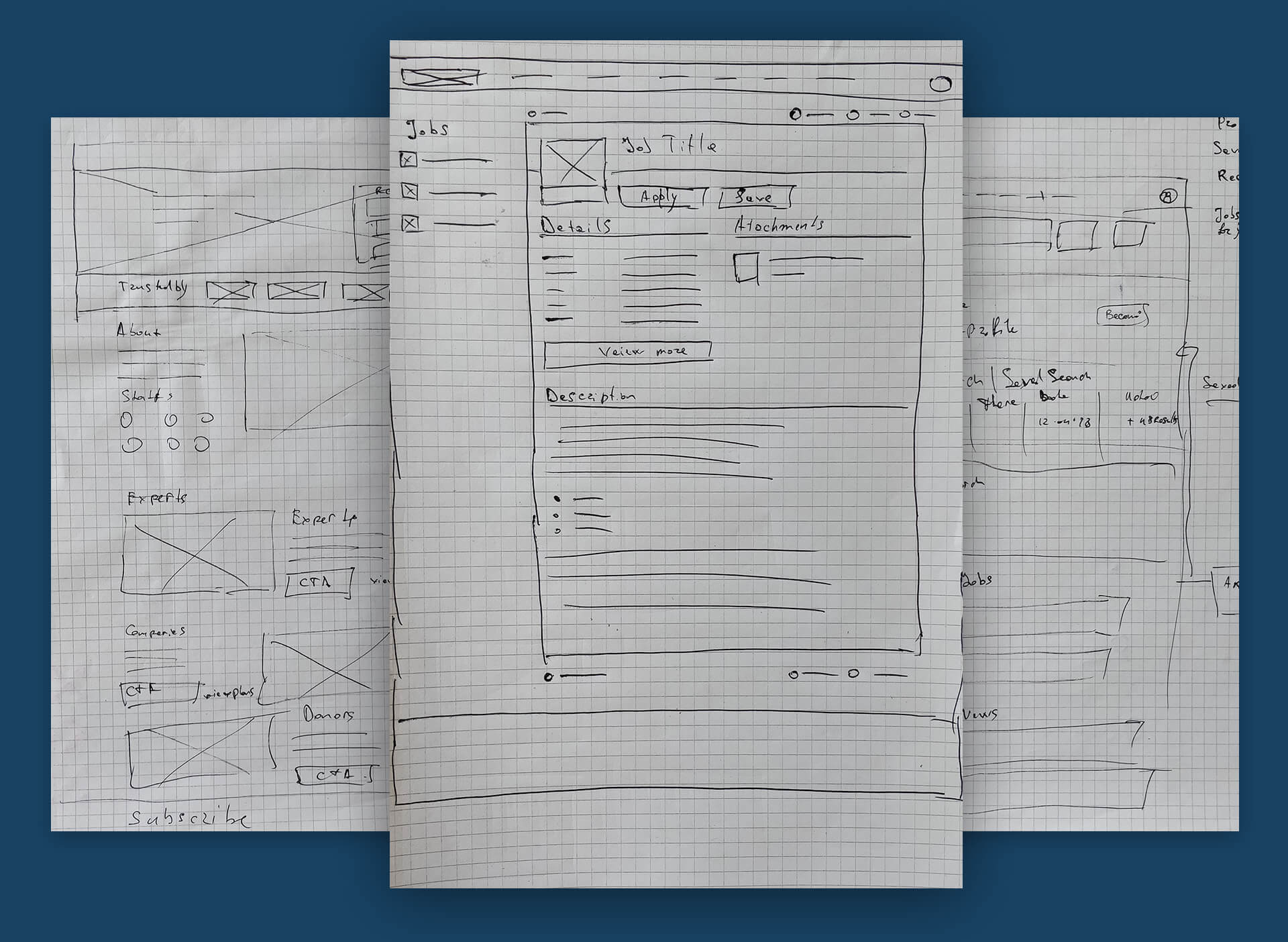
Sketches
Once the research was organized and the solution defined, I began to explore the potential designs for the website. Rapid sketching exercises enabled me to generate the very basic concepts, helped translate my thoughts into tangible ideas and better visualize the company’s problem.
I then tested these with 3 participants to validate whether these solutions addressed both the user and business needs.
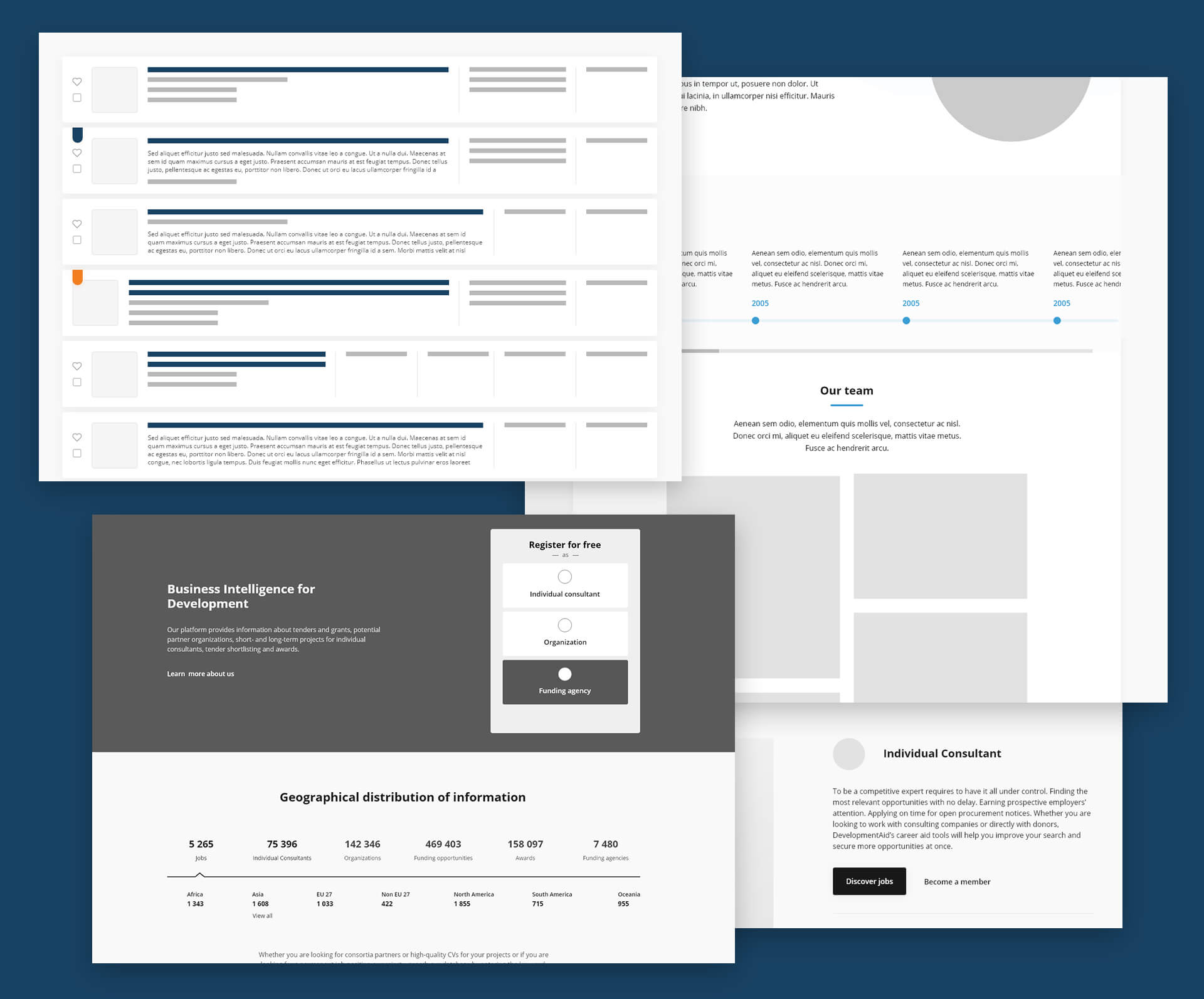
Wireframes
After the core functionalities were defined it was needed to include them in the solution, therefore I created quick, low-fidelity wireframes.
The wireframes were heavily focused on how I structured the information and found elegant solutions to implement the same approach for different pages on the website for the sake of consistency.
Using these wireframes, I was able to conduct usability testing with 3 participants. This allowed me to gather some significant feedback to help me decide what to include in the final experience before jumping into the next iteration of the design.
Design System
In order to centralize the UI elements, to ease and scale up the entire process of design and development I created a design system.
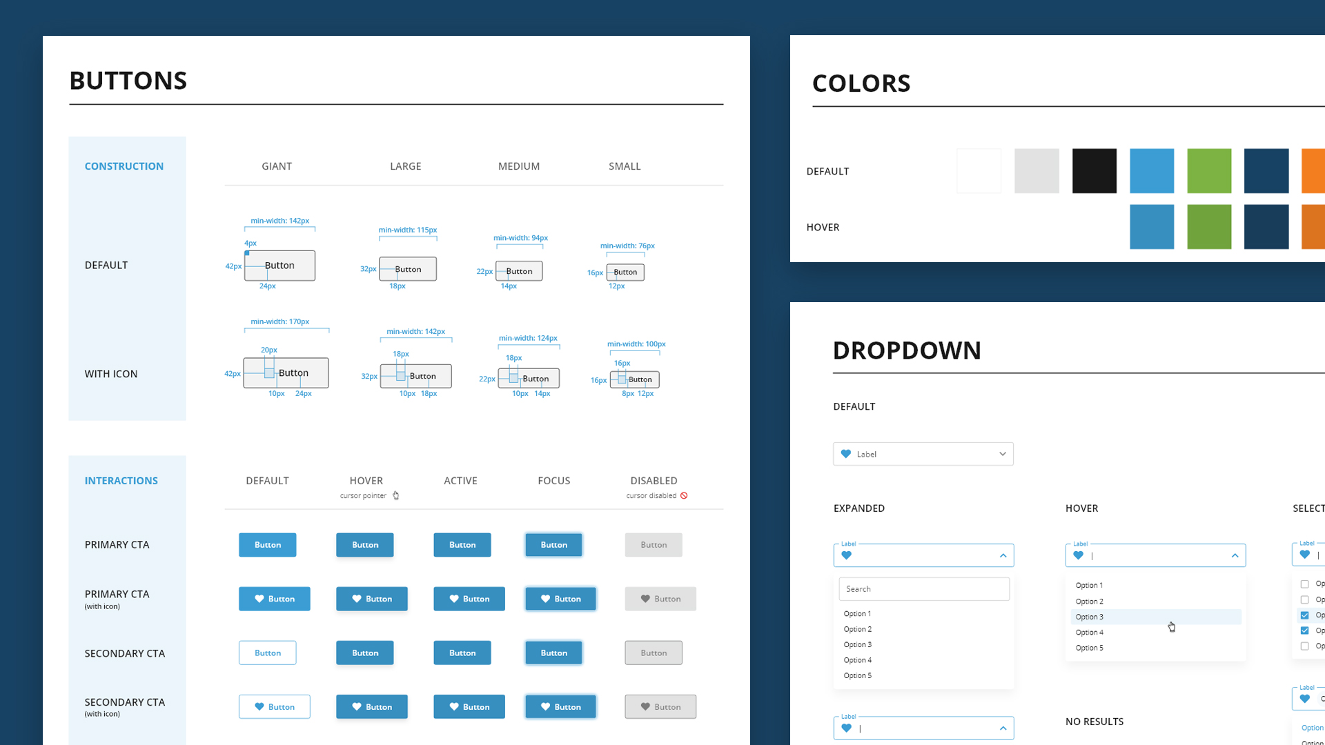
Icons
In addition, based on the fact that it was needed to have a multitude of unique icons that couldn’t be found within other existent icon packs on the web, I considered it critical to create a custom icon pack
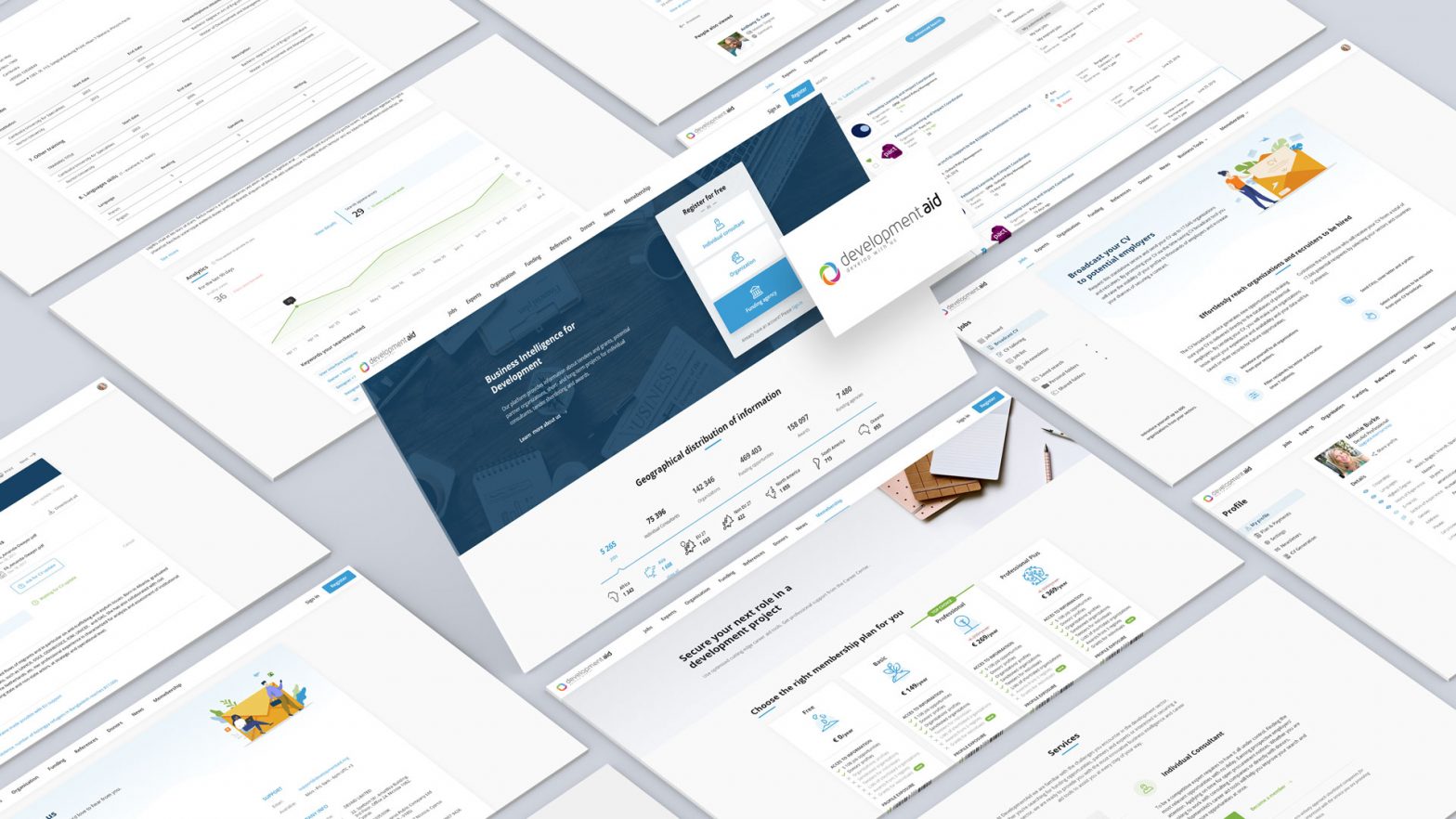
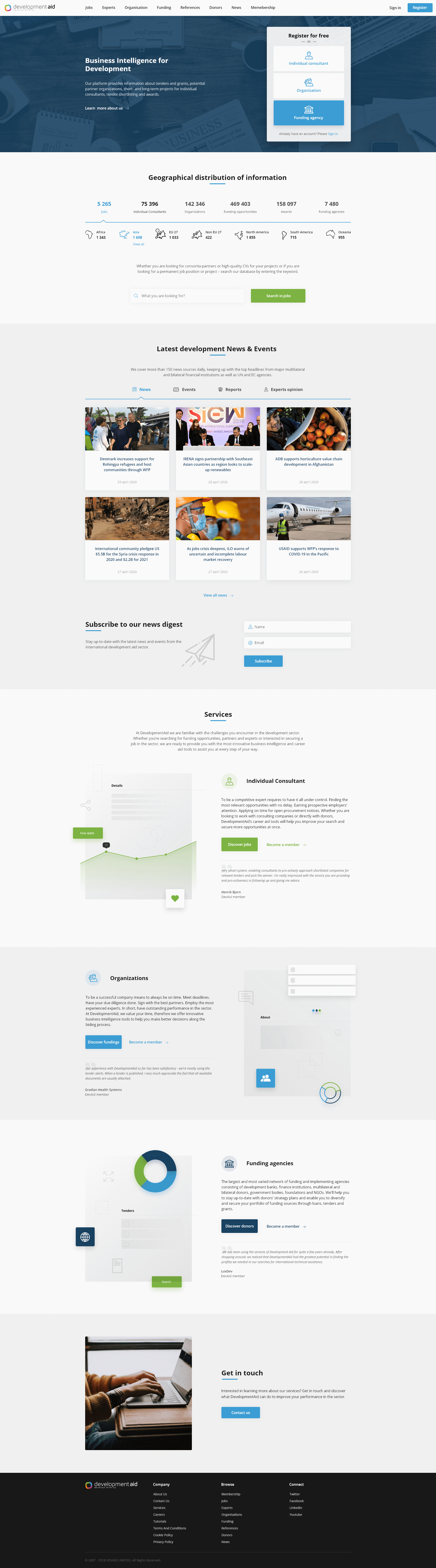
Homepage
The main purpose of redesigning this page was to make the company and its main services as attractive as possible. At the moment, the home page has limited functionality. According to the analytics, 75% of new users access this page. I have presented the main pillars of the company’s activity that represent experts, organizations and funding agencies, as well as other key pages such as news and events pages
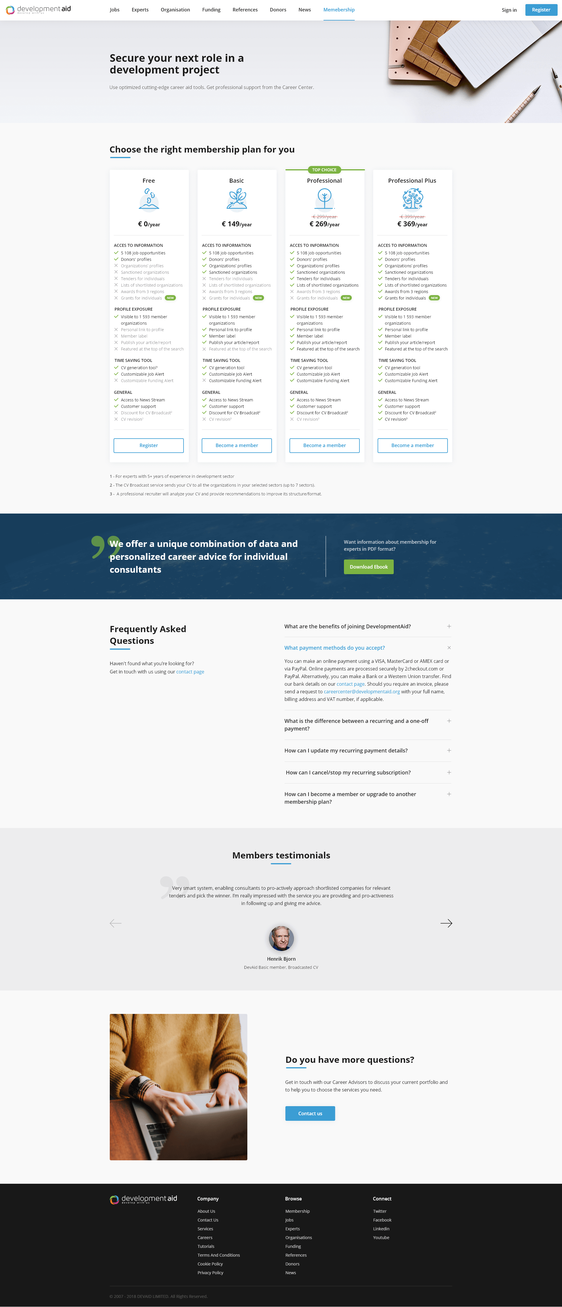
Membership Page
For this page, I have modified the presentation of membership types from tables into cards in order to be studied and understood more easily. It was also added the FAQ section that is going to contain the most common questions that the support team receives. I also visually streamlined the slider with testimonials, it’s easier to read a comment at a time.
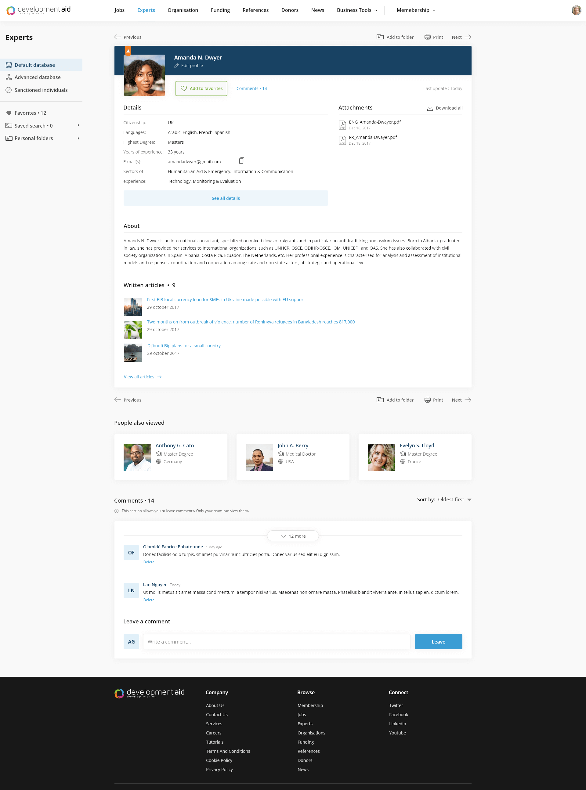
Expert Page
On the Expert page, there was modified the structure of the blocks makes it easier to get acquainted with the selected candidate. I have added new sections like Similar Experts and comments for the companies who have access to this page.
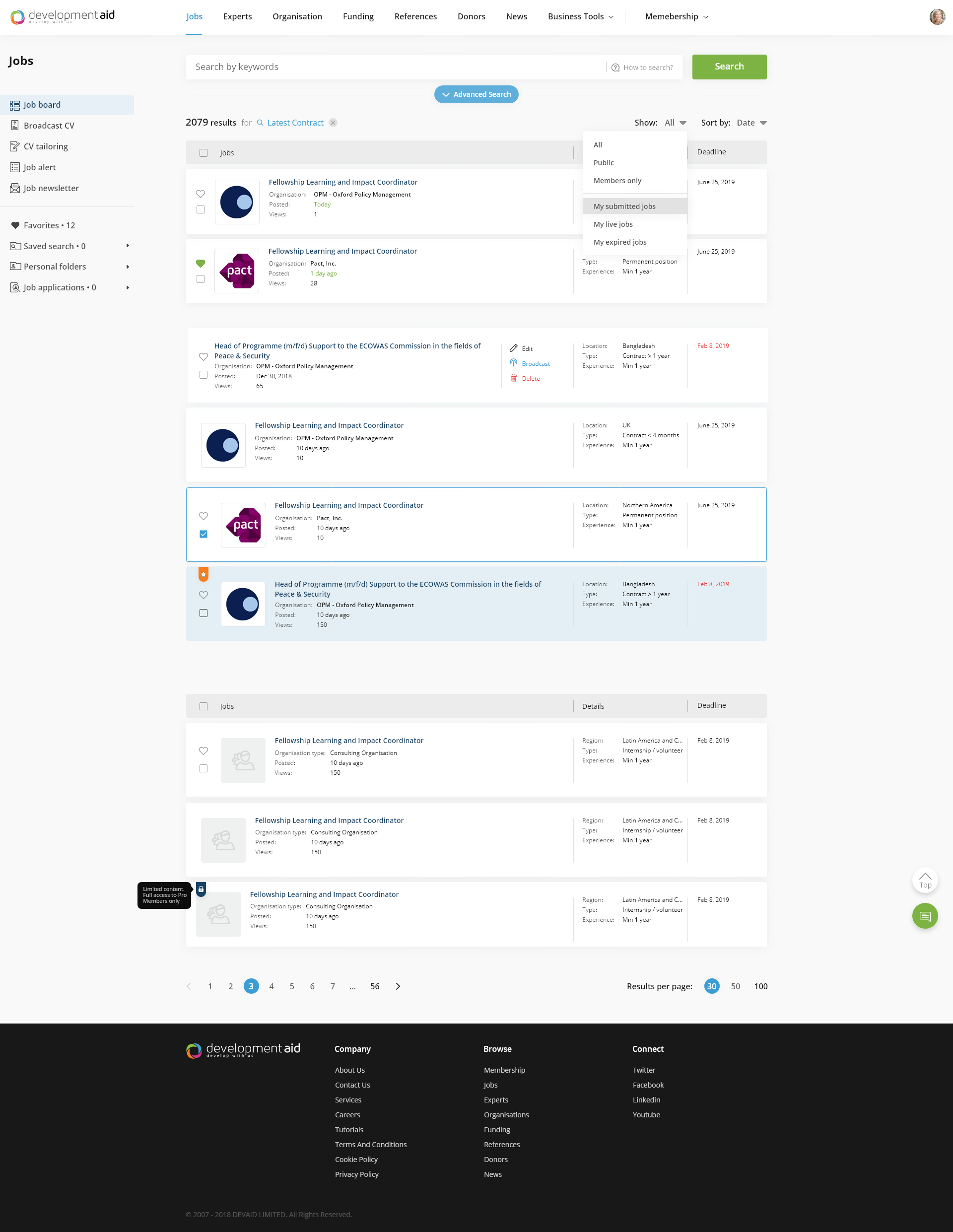
Search Results
Here again, I have changed the table layout into the card table to visually download the search results and thus make it easier to distinguish the highlighted results. On some other pages, the information on the cards was also rearranged accordingly.
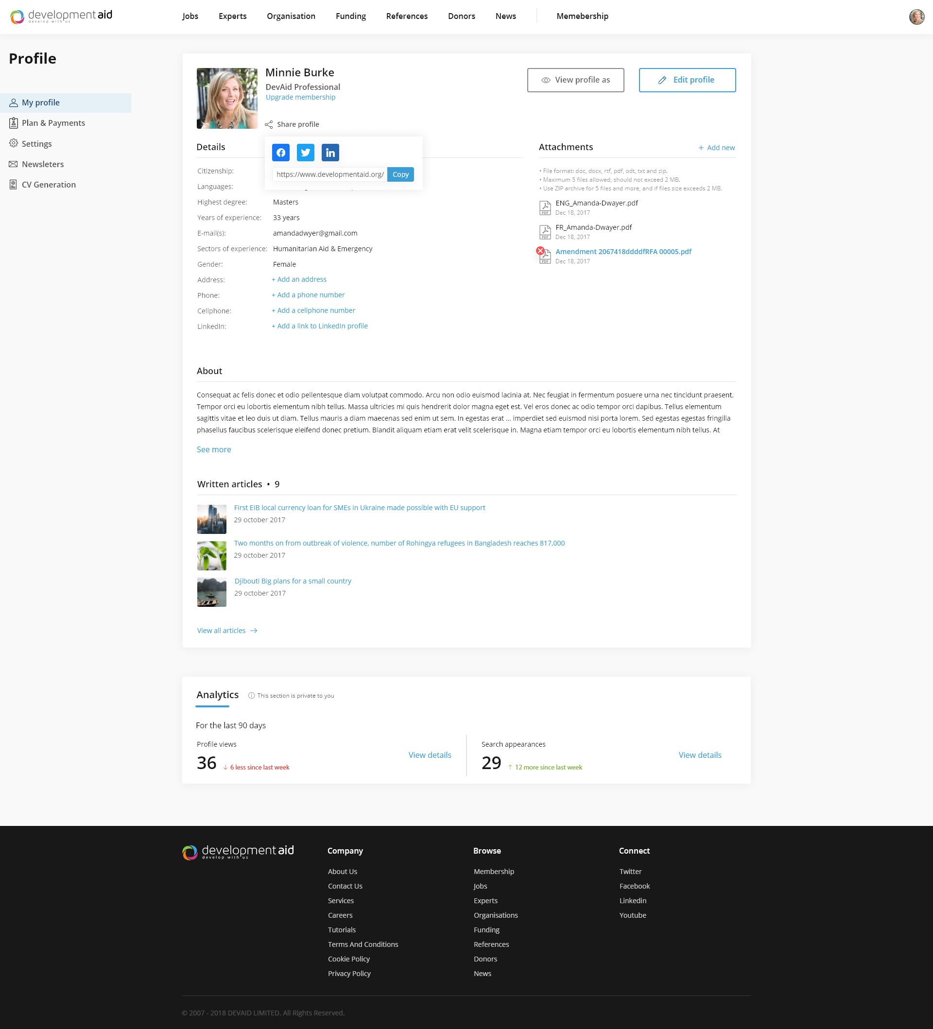
Expert Profile
In order to transform it into a real profile page, the Expert page has been modified significantly. All information that is added to the site by the user like a photo, about, details, and CV is presented in an understandable and easily editable manner
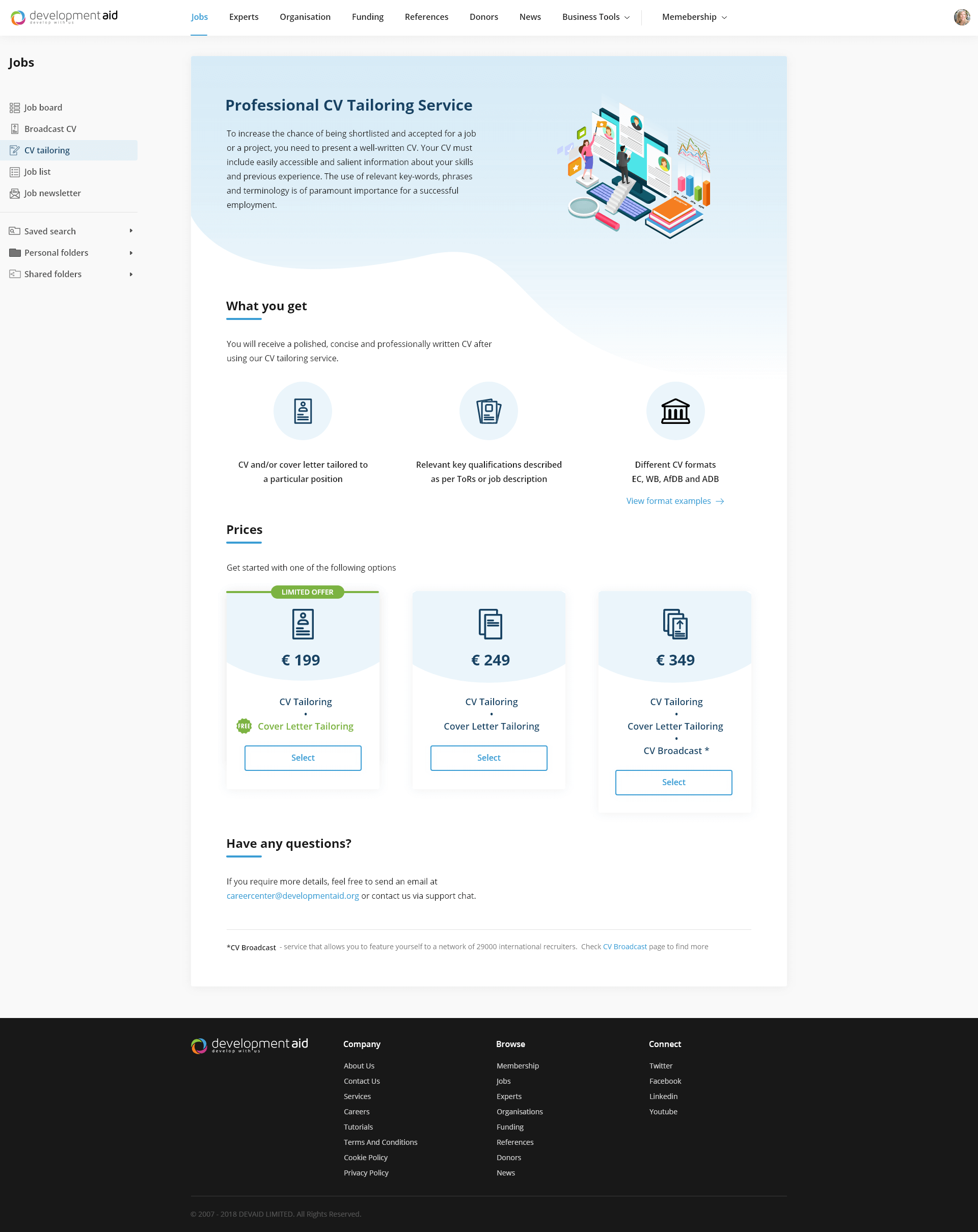
CV Tailoring
This is an additional service offered to experts, which is currently only presented in the form of text. For ease of comprehension, I divided the page into blocks and added other items such as illustrations, icons, price tables. I also modified the purchase process that currently doesn’t exist online, but is executed by email request to the company’s representatives. Thus we introduced the online purchase cart in which the user adds the necessary information and purchases the service independently.
Retrospective
What went well?
• I received meaningful insights from survey research. Definitely, something I will continue to do for future projects.
• The design system is a lifesaver, it helped me and the development team a lot during the working process.
• Despite all the technical requirements and work volume, I was capable of bringing consistency to the project.
What needs improvement?
• Some of the survey questions could have been structured better to reach better insights.
• As it was my first experience with the design system, I consider it has a lot more room for improvement.
• Sometimes it was challenging to be on my own in the design process. One or two pairs of hands and brains could’ve been useful.